
EAlexander
-
Posts
1,031 -
Joined
-
Last visited
-
Days Won
26
Content Type
Profiles
Blogs
Forums
Gallery
Pipeline Tools
3D Wiki
Plugin List
Store
Downloads
Everything posted by EAlexander
-
@Igor Here's some thoughts on improving renders that I tell my students: There is no substitute to education as spending time in the software. You just need to build and render as many scenes as possible. Every days and quick studies have been instrumental in my learning - and a lot of them fail or never see the light of social media, but I still learn tons from them. It takes a lot of time - learning the software is only part of the journey. Lighting is key - beautiful topology and hyper real materials will all be useless if the lighting is off or bad. This is the number one thing I see in renderings that need improvement. Imitation is the best way to learn at first. Too many people try to take on learning 3d or improving 3d and being a designer/photographer/stylist all at the same time. I suggest that you find photos that you like and try to reproduce them. This way you have a specific lighting goal in mind as well as architecture or design choices are minimized and you can focus on your craft. Later, you can design it all, but while learning - only take on one thing at a time. See attached - I still do this regularly to try and improve. I take liberties and change things around a bit, but the general look and feel vibe is already established. This is key. (this might be a great challenge too - post a photo and see if beginners can try to reproduce it. I have my students do this with modern kitchens.) Keeping in mind that I teach film and stage designers how to render - I think one should look to film lighting as the inspiration for making images. I think people get too tripped up in trying to be mathematically photo real, so if the sun is at this level and the window is this tall and the light should hit the wall here and then it should look real.... This is not how photographers and cinematographers work. No photographer for Architectural Digest goes on a shoot without a full set of lighting equipment. If you study film lighting, you will see that the proximity and the scale of lighting in film (HUGE) is used, even when subtle realism is involved. So I say study film lighting more in depth. See attached examples and take a look at: http://mattscottvisuals.com/lighting - a great resource that shows the lighting layout for advertising shots. There are lots of Instagram sites dedicated to film lighting and BTS setups like @filmlights and others. Subscribe to these and study the rigs. Hope that helps some - always happy to share my settings and lighting setups for any images I post if folks are curious. -evan
-
Nice work! That atmosphere break with sparks is 🔥🔥🔥
-
Night.
-
You can do it! Thank you.
-
More architectural work. Day.
-
04.22 Interior
-
 Thanks! This is great to look over and see how you set up all the loops.
 -
Very excited for S2!!
-
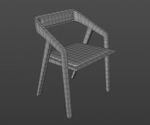
More modeling practice: The Katakana Chair designed by Sean Dare @ Dare Studios.. Thanks goes out to Cerbera and Igor on this one - take a look at this thread where they help me sort out how to tackle this chair in SubD. Thanks guys - it's not perfect, but a huge leap forward for me in understanding.
-
Thanks Igor! Curious to hear what you have planned.....
-
More Sub D practice. It's still dense and lots of mistakes, but each one gets better, so I just need lots of practice. All quads though, just too many of them 🙂
-
Thanks Igor - this looks cool! I also just signed up as a contributor - thanks for making this place run!
-
This is the weirdest self portrait I've ever seen 😂
-

Control multiple light's color from one control (Corona renderer)
EAlexander posted a topic in Nodes
Hi, Xpresso lightweight here. We have a show with multiple pieces of scenery that have multiple area lights attached to them. I'm trying to control the intensity and the color of the lights from one control setup. For the intensity, it's as simple as a Set Driver on one of the lights and Set Driven (Absolute) on the other lights and it works great. When I try this on the color, however, it doesn't work. Looking for recommendations on a simple way to link this up? I'm using Corona renderer and Corona lights if that makes any difference (though I can't imagine it would). Thanks in advance! e. -
-
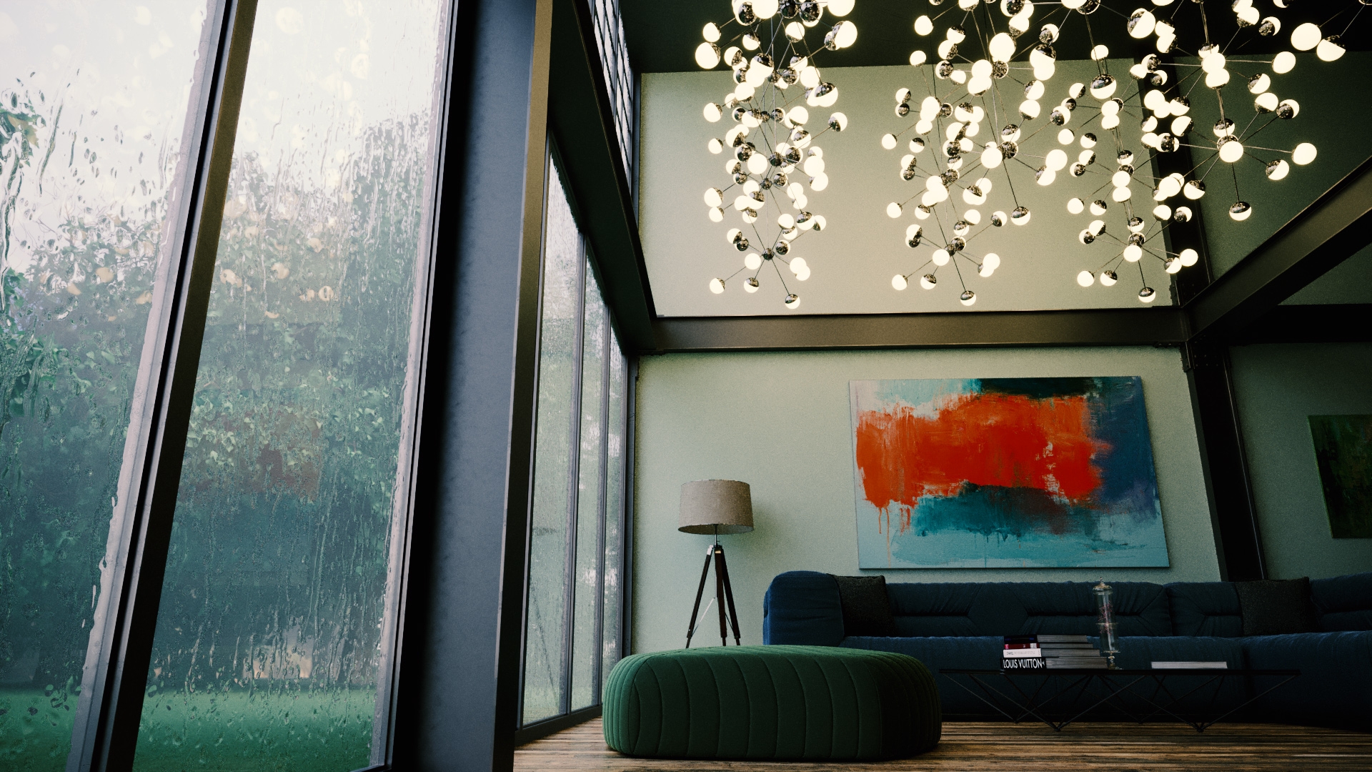
Well Sketchbook 03 just maxed me out. It hit 12,500 views - so thank you all for looking! Time to start fresh with Sketchbook 04, so here we go. Working on modeling and put together this Art Nouveau Armoire. I modelled the base cabinet in Vectorworks and then moved it to Cinema for the detail work (carving) as well as materials, lights, render, etc. This is using Corona 6 with R23. Thanks for looking - away we go.
-
Hi, Cool start! I feel like the lighting is unmotivated I. E. Like there is a huge invisible sphere floating above the scene. It's not sunlight, and it's not coming from the street lamp, so it feels a bit weird. I would also tone down your white materials a bit. I usually use 70-80% grey for white objects. Your sidewalk is burning out so we have no contrast or shadows for the tables. Keep going! And try some other lighting options.
-
I came for the clay. I stayed for the SSS.
-
Yes to all of your questions. Relative scale of surrounding objects is key. You could also play with composition and smaller camera lensing to make it look more like it's looming over us.
-
*cough *McLaren* cough *
-
Looking good. I think it's hard to adapt a character that is so ingrained in our culture as 2d, but this is getting there. I remember an old episode where Bart goes into some kind of 3d wormhole and they did a sequence with him rendered out as a model and it felt a lot like this. Curious to see where this lands.
-
Looks cool! I'd love to see some more wear and tear on the larger blue areas, which is looking a bit plastic like. Keep going!
-
Haha this is great!
-
Yes, excellent! Thank you both for your hard work!
-
Hi - are you doing the exploded views manually or are you using an effector with offset? Looks so cool! I've done them, but never that organized. e.