Cerbera
-
Posts
17,889 -
Joined
-
Days Won
717
Content Type
Profiles
Blogs
Forums
Gallery
Pipeline Tools
3D Wiki
Plugin List
Store
Downloads
Everything posted by Cerbera
-
Not sure there are many people here who would still use that, so you may get faster help contacting Lazaros directly at nitro4d.com. CBR
-
It's always a pleasure to try and help you - I am impressed by the way you think about things like backstory and the reasons for things being where they are - there really aren't enough people doing that in their rendering, and I am reminded of it on a daily basis every time I see another chrome sphere in a desert :) Damn those everyday's for encouraging people to rush stuff, and get it out any old how, with only the briefest of thought or consideration for any one aspect... No, I am much more rewarded and impressed by people like you that are willing to spend a long time reviewing and revising an image until you are totally happy with it yourself, and proud to show it to anyone else because you really took that time to do it well. Keep going my friend, you're winning a long way before you get to the end ! ;) CBR
-
Were you tempted to give him a little white pointy hat ? :)
-
Getting better all the time... Now I'm worried about contrast and busyness. :) I like high contrast scenes on the whole, and generally speaking they are better and more impactive / impressive for the viewer. But here, it's working against you a little bit - it's a little too harsh, and exactly the same over the whole image, which confuses the eye, and leads to it not flowing across the scene. You may or may not care about such things, but you could fix it either in post, or with additional 'bounce' lighting if you felt so inclined... I see you've left the sunlight almost blowing out in certain areas, which I assume was to try and get the strong sunlight feel, but it's a slightly wanton eye distraction to have front center in an image. I suspect you could solve a lot of it by putting some clouds in the sky to diffuse and soften that sunlight. I'd be tempted to not overexpose it all in Cinema, but resolve to add a softer and more aesthetically subtle exposure / glow in post. Busyness is another thing that distracts the eye, and there's a lot to look at here ! I wonder if it wouldn't be more effective if there was less - small focused groups of objects that draw the eye and hold the attention, rather than 100's of things of equal contrast and and complexity all screaming 'look at me' ! :) If you did want to keep all those things, you could try and direct the eye a bit more with some subtle depth of field, which will help isolate focus, add to perceived depth and increase variation across the image, all to good effect I would have thought. Lastly, do you think your bricks are a little too saturated ? Old rough brickwork like this is sometimes much greyer than you'd think, even in bright sun, and I just feel it's a little overpowering at the moment... Obviously I am being 'maximum picky' here, and if you disagree with me, of course feel free to disregard any or all of my late-night ramblings :) CBR
-
Well that's good, in that loads of people missed it / were looking for it when it disappeared, but bad if you do have to pay again. Perhaps you should expect to pay a little more for the update, but I agree you shouldn't be paying full price. pls do email Toolfarm, explain, and l.et us know what they say ! Good luck :) CBR
-
Yeah - I'm with you there. It was worth it when I was hobbyist, and is even more so now when just a single typical job pays for a year's MSA - it's a no-brainer :)
-
Done :)
-
I'll do it for 9, 995 ;)
-
Yep, what he said. You'd have to have some pretty incredible skills, and immediate feedback from client at several key stages to have any hope of turning that round in 24 hours. CBR
-
Yeah, that's the only thing; don't get more than 2 versions behind, or you'll have to buy it again with no discount. You can check the MAXON site to see how much they are charging to go from 16 to 18 (it's roughly half price), but they don't even mention any versions before that, so I think you'd be back to full price were you trying to upgrade from 15. CBR
-
see 'complete atomization' ;)
-
New taser does complete atomization, and provides attractive particle displays when stuff explodes.
-
It's OK. I've stood them down. That was a test, GI Vector, and you have just passed your annual review. Newer, better taser in post.
-
That is a lot of rain. Hopefully the Texan spirit will pull you all through... I see you've already started :) Seriously though, hope you're all OK... CBR
-
Oh thank you. Nailed it ! CBR
-
No need, my friend, I've become convinced it's beyond me :/
-
Your instructions aren't very clear. I'm trying to follow your cube tutorial above, and it's not working. I just don't know where I'm going wrong... CBR
-
R18 will continue to be a powerful piece of software no matter what comes after it, and you don't have to have the latest version of something to be producing quality work. I stopped updating Photoshop when they started their monthly rental scam scheme, and nothing I have needed to do since has not been possible in the older version of the software. You'll be good for a few years yet I would have thought... CBR
-
Very cool :) Genius animation, and awesome sound design. CBR
-
First of all it's a very nice render, beautifully textured and lit, so definitely winning there. But the modelling isn't going quite so well, as @VECTOR mentioned. You're actually getting small shading errors if you look closely at the ports areas, and you could do with another edge loop between the top of them and the ridge above so that the ports don't disrupt the edge flow of the circular rim. However it is probably not so severe that you couldn't sort it out by increasing the phong angle a bit. You also have some complex poles that don't need to be there. The booles are horrible - look what they've done to your topology ! And there was no need for them - you had easily enough segmentation there to model the holes properly. But don't be discouraged - your excellent work in the texturing, lighting and rendering, combined with no SDS has largely mitigated any dodgy modelling to all but the most critical eye. CBR
-
Yep, just keep doing it, and keep caring that you are doing it well, and you'll get there :) In a year you'll look back at your initial meshes and laugh your ass off :)
-
Yep, 'pretty good' might be slightly optimistic; what I meant by that is that it's not too bad for someone in the early stages of learning modelling, and that it's probably good enough to animate OK :) That isn't to say the mesh is ideal - you have some weird edge flow going on in places, and complex poles (6 or more points convening) in a few more places (mainly hands), but most of the less-than-ideal edge flow isn't where you will be deforming when animating, so you'll probably get away with most of it ;) CBR
-
SSS working nicely there :) I assume you are showing us the subdivided wireframe ? If so that's Ok, and your basic loops look pretty good. But if that's the base besh isoparms, without subdivision, then I'd say it's too high poly in places to be animating easily. CBR
-
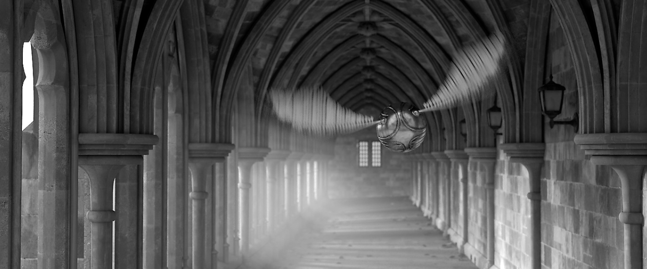
I like the general feel of this, but it's not passing any 'spot the noise' tests for me at the moment :) Especially on the floor, but elsewhere too the dirt looks like sort of low res smudges with not enough detail or variation in them. The window frames at the end are suffering worst from this. So whereas you may be using one noise type of quite low octaves, try a layer shader with at least 4 different types at different scales, and with lots of octave detail and attention to delta to make sure you are getting nice detailed roughwork. And you may want to consider a displacement based texture for the mossy walls - we can tell too easily on the right hand side that this is totally flat. Oh, has the greenhouse glass got any physical thickness to it ? I'm not sure I'm expecting the wall bricks to warp like that when viewed through it... Other than that, looking good so far ! :)
-
They do eventually. But it adds value to have them on Cineversity first I guess...